
DV-EXP-3


Exercise 4: GGPLOT2 in R

Group manipulation and data reshaping in R, understanding the philosophy of ggplot2, bar plot, pie chart, histogram, boxplot, scatter plotand regression plots


1.    Write R Script for Group Manipulation and Data Reshaping

For following data

Group

A

A

B

B

C

C

Value

10

15

12

18

8

14


Answer:

# Install the dplyr package if not already installed

if (!require(dplyr)) {

  install.packages("dplyr")

}

if (!require(tidyr)) {

  install.packages("tidyr")

}

library(dplyr)

library(tidyr)

# Load necessary libraries

library(dplyr)

# Create a sample dataset

data <- data.frame(

  Group = c("A", "A", "B", "B", "C", "C"),

  Value = c(10, 15, 12, 18, 8, 14)

)

# Group manipulation: Calculate the mean value for each group

group_means <- data %>%

  group_by(Group) %>%

  summarise(Mean_Value = mean(Value))

# Data reshaping: Convert to wide format

wide_data <- pivot_wider(group_means, names_from = Group, values_from = Mean_Value)

# Print the result

print(wide_data)


OUTPUT

# A tibble: 1 × 3
      A     B     C
  <dbl> <dbl> <dbl>
1  12.5    15    11


=================================================================================


1. 2.  Display scatterplot for two variables by assigning random values to them using ggplot2.


OUTPUT


=============================================================================================

3. 3.    Display Histogram for two variables by assigning random values to them using GGPLOT2.
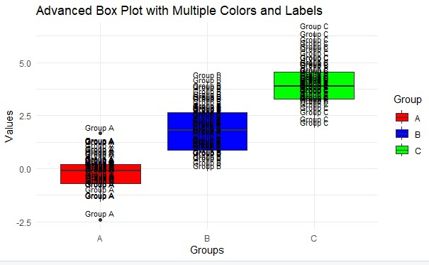


                OUTPUT


============================================================================================================

44.    Display Boxplot by assigning random data using GGPLOT2 with multiple colours and labels wherever possible.


=======================================================================================================================

4. Display piechart by assigning random data using GGPLOT2 with multiple colours and labels wherever possible.


OUTPUT


=====================================================================================================================

6. Display scatterplot with regression line by assigning random data using GGPLOT2 with multiple colours and labels wherever possible.


OUTPUT


=========================================================================================

EXPERPERIMENT-5

Display scatterplot with regression line by assigning random data using GGPLOT2 with multiple colours and labels wherever possible.


OUTPUT


1.    Create a scatter plot with gradient filing using ggplot2  for sample data.


OUTPUT


Comments

Popular posts from this blog

Data Visualization

Welcome to Data Visualization Lab  B.Tech Information Technology, II Year I Semester, Section C Softwares for Installation Test Link  https://forms.gle/Fnh79CyodToWTGBj7 RStudio Link:  https://posit.co/download/rstudio-desktop/   Power BI Link https://www.microsoft.com/en-us/download/details.aspx?id=58494 Tableau Desktop https://www.tableau.com/products/desktop/download  Week-1 Experiments List https://drive.google.com/file/d/1UlRKXTY9OdK7QyVLa7H-_dmaJkimuecs/view?usp=drive_link  W3Schools -> R Programming  https://www.w3schools.com/R/ Experiments List List of Experiments 1: Programming Practise in R  - Click Here List of Experiments 2 :  Click Here List of Experiments 3 : Click Here   

JAVA_Full_Stack

  Steps to Ensure Compatibility and Optimal Setup: Download and Install Eclipse : Go to the Eclipse Downloads page and select the "Eclipse IDE for Enterprise Java and Web Developers" package. https://www.eclipse.org/downloads/packages/release/2023-12/r   Download and Install JDK 17 : Obtain JDK 17 from the Oracle JDK Downloads or the OpenJDK 17 page. Follow the installation instructions specific to your operating system. Download and Install Apache Tomcat 10.1 : Download Tomcat 10.1 from the Apache Tomcat Downloads page. Extract the files to a convenient directory. Configure Eclipse to Use JDK 17 : Open Eclipse and navigate to Window > Preferences > Java > Installed JREs . Click Add , select Standard VM , and point it to the JDK 17 installation directory. Set JDK 17 as the default JRE. Configure Tomcat in Eclipse : Open Eclipse and go to Window > Preferences > Server > Runtime Environments . Click Add , select Apache Tomcat v10.0 , and point it to the di...

Tableau

TABLEAU EXPERIMENTS Consider the Dhoni Dataset  click here  solve the following experiments using Tableau Tool Here are a few experiment ideas for students to create visualizations in Tableau using the cricket dataset: Experiment 1: Runs vs. Opponent Objective:  Visualize how the player's performance in terms of runs varies against different opponents. Task:  Create a bar chart showing the total runs scored against each opposing team. Additional Insight:  Add a color gradient to highlight highest to lowest run totals. Experiment 2: Performance Over Time Objective:  Analyze the player’s performance trends over the course of the season. Task:  Develop a line chart that plots runs scored over time (by date). Additional Insight:  Include a dual-axis to plot catches and stumpings alongside runs. Experiment 3: Heatmap of Performances by Stadium Objective:  Compare the player’s performance at different stadiums. Task:  Create a heatmap to displ...